A successful website or application does not begin with screens and layouts. It begins with visual direction. In professional UI and web design practice, the look and feel design process is the stage where a product’s personality, mood, and brand character are defined before detailed interface design begins.
This process ensures that design decisions are not based on guesswork or personal preference, but on brand strategy, user expectations, and visual consistency. Agencies that follow a structured look and feel methodology consistently deliver stronger digital experiences and more recognizable brand identities.
Talencee, a branding focused web designing agency, applies a systematic look and feel framework to ensure every application and website it designs communicates a clear and intentional visual character.
This article explains the look and feel design process in a structured, informational format and outlines the three core steps used to give character to an application.
What Is Look and Feel in Design
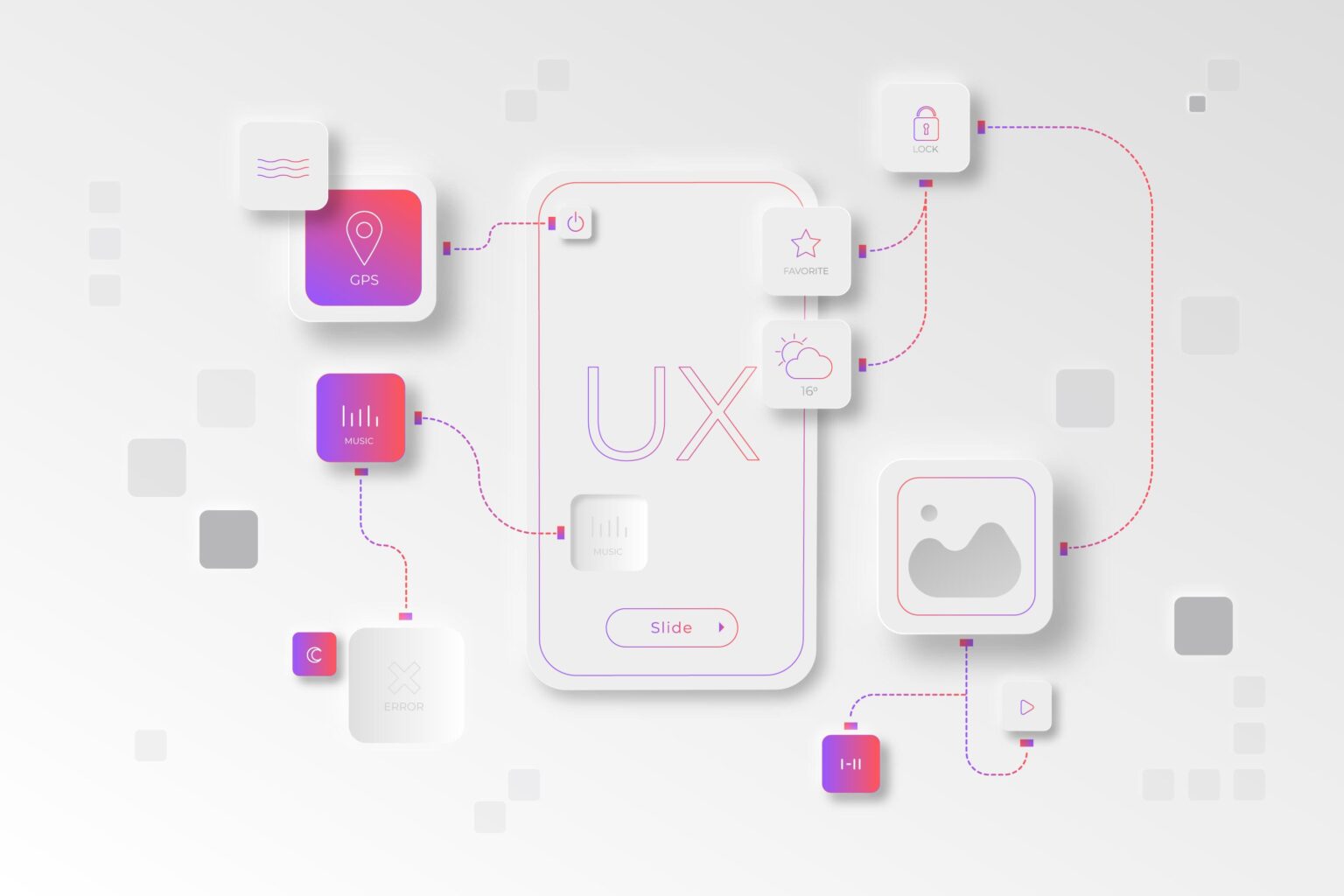
Look and feel refers to the early visual exploration phase of UI and UX design where the stylistic direction of an interface is defined. It focuses on mood and visual language rather than final layout details.
The look and feel phase typically establishes:
- Color systems and contrast logic
- Typography style and hierarchy
- Core UI element appearance
- Iconography direction
- Shape and component geometry
- Visual density and spacing
- Light and dark theme approach
This stage provides a visual foundation that guides the detailed interface design phase. It reduces ambiguity and helps stakeholders align on visual direction early in the project lifecycle.
Why Look and Feel Design Matters
Look and feel design plays a critical role in digital product success because users form impressions quickly. Visual tone influences trust, usability perception, and engagement behavior within seconds.
A structured look and feel process helps organizations achieve:
- Stronger brand consistency
- Faster UI design execution
- Reduced revision cycles
- Clearer stakeholder alignment
- Improved perceived quality
- Better user trust signals
From a branding and web design standpoint, this phase is not decorative. It is strategic.
Step 1: Preparation and Visual Strategy
The first step in the look and feel design process is preparation. Visual exploration must be grounded in brand and user context before creative work begins.
Professional design teams begin with structured discovery discussions and workshops involving stakeholders and decision makers.
Key preparation areas include:
- Brand values and style direction: Designers identify the emotional attributes the product should communicate, such as modern, authoritative, friendly, minimal, or premium. These attributes influence color, typography, and visual weight.
- Target audience expectations: Different user groups respond to different visual styles. Enterprise tools, consumer apps, and lifestyle platforms require different interface tones.
- Existing assets and brand materials: Logos, previous screens, and brand guidelines are reviewed to ensure visual continuity.
- Competitive landscape review: Competitor interfaces are analyzed to identify patterns, risks, and differentiation opportunities.
At Talencee, this preparation phase produces a visual brief that guides all look and feel exploration work.
Step 2: Inspiration Research and Moodboard Development
The second step is structured inspiration gathering. Designers collect and evaluate visual references that match the approved brand direction.
Sources of inspiration typically include:
- Modern website interfaces
- Application UI systems
- UX and UI pattern libraries
- Typography frameworks
- Color palettes
- Icon systems
This research is organized into moodboards, which are curated visual collections that represent specific design directions.
Each moodboard expresses a distinct visual personality. Examples include:
- Minimal and editorial
- Bold and high contrast
- Friendly and rounded
- Premium dark mode
- Soft and lifestyle driven
Moodboards usually contain:
- Color palette samples
- Typography styles
- UI element references
- Icon and illustration examples
- Layout density patterns
Moodboards function as decision tools. They allow stakeholders to evaluate visual directions through concrete examples instead of abstract descriptions. This significantly improves alignment and reduces misunderstanding.
Talencee typically develops multiple moodboard options so clients can compare directions before selecting one.
Step 3: Look and Feel Screen Design
The third step is applying selected visual directions to a real interface screen. This is known as look and feel screen design.
Instead of designing the entire product, designers select one important screen such as a homepage or dashboard view. Multiple visual variations are then created using different style treatments.
Each variation keeps the same structure but changes visual expression.
Common variation factors include:
- Color palette usage
- Typography combinations
- Button and control styling
- Corner radius and shape language
- Icon style
- Light and dark theme versions
- Graphic accents and gradients
This approach allows stakeholders to compare visual personalities under controlled conditions. Decisions are based on side by side evaluation rather than isolated concepts.
Brand driven web design agencies such as Talencee use this method to validate visual character before scaling into full UI systems.
Role of Feedback in the Look and Feel Phase
Feedback is an essential component of the look and feel process. However, it must be focused and structured.
Effective feedback evaluates:
- Brand alignment
- Audience suitability
- Visual clarity
- Trust and credibility signals
- Emotional tone
Detailed micro adjustments are typically deferred to later UI design stages. At this phase, feedback should concentrate on overall visual direction.
Visual references improve feedback quality. Showing preferred examples is more effective than describing preferences in abstract terms.
Conclusion
The look and feel design process is a foundational stage in professional website and application design. It defines visual character, aligns brand expression, and guides downstream UI decisions.
The three step framework of preparation, inspiration research, and look and feel screen design provides a reliable structure for developing strong visual identity in digital products.
When applied correctly, this process produces interfaces that are not only visually appealing but also brand consistent and user aligned. Agencies that treat look and feel design as a formal strategic step consistently deliver more effective and recognizable digital experiences.