Here is a scenario we see almost every week.
A marketing manager or founder comes to us frustrated. They have doubled their ad budget on Facebook and Google. The metrics look great on the surface: Impressions are skyrocketing, Click-Through Rates (CTR) are healthy, and traffic to the website is at an all-time high.
But sales have stayed flat.
The immediate reaction is to blame the ad platform.
- “Facebook’s targeting algorithm is broken.”
- “We are getting bot traffic.”
- “Google’s CPC is too expensive.”
While ad optimization is important, 90% of the time, the problem isn’t how you are getting people to your site. The problem is what happens after they arrive.
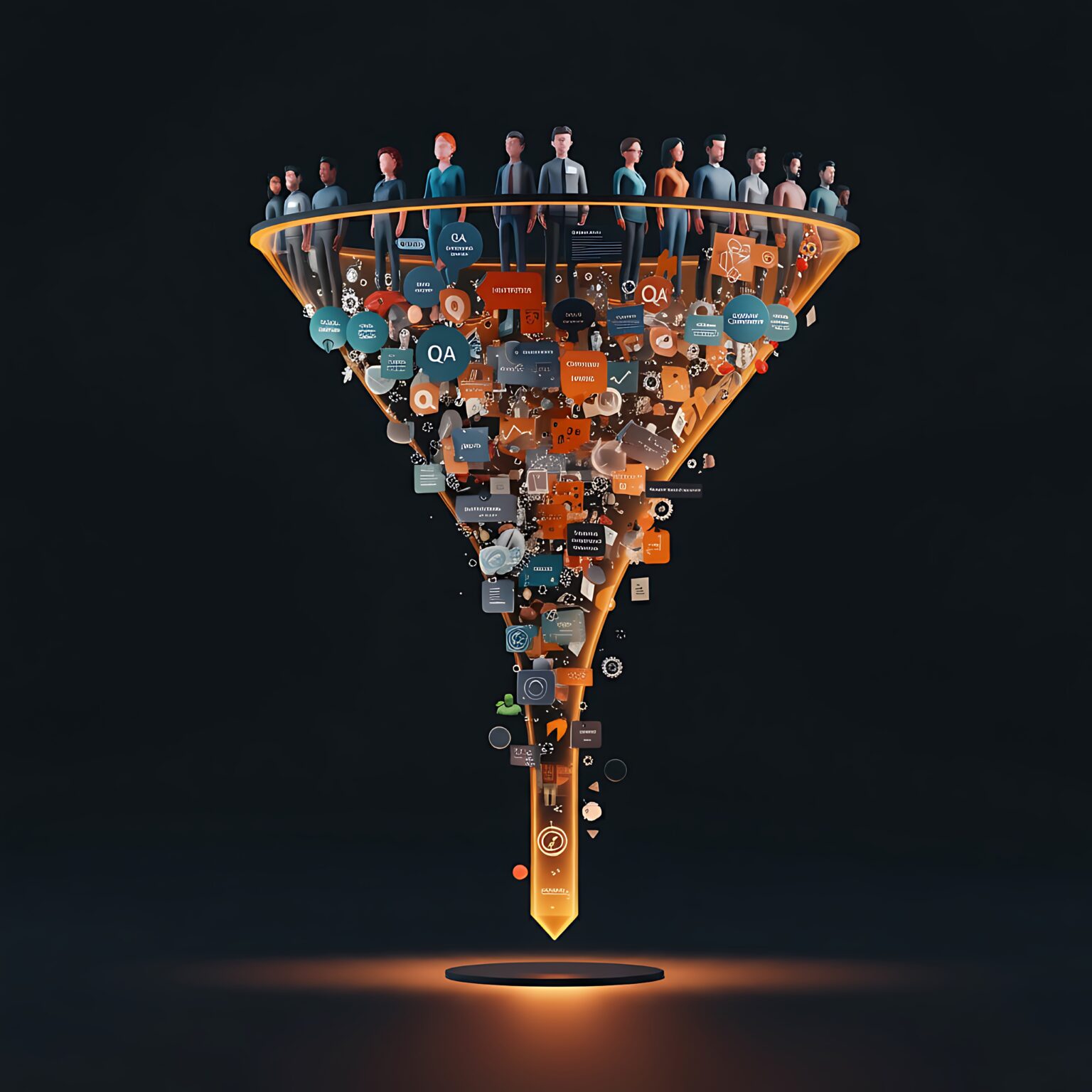
You are pouring high-quality water into a bucket full of holes. This is the difference between Lead Generation (getting them there) and Conversion Rate Optimization (getting them to buy).
The “Click-to-Clarity” Gap
When a user clicks an ad, they have a specific psychological expectation. They have been “promised” something by your creative.
- If your ad shows a sleek, modern SaaS tool, but they land on a website that looks like it hasn’t been updated since 2015, you have broken their trust.
- If your ad promises “Instant Quotes,” but the landing page forces them to create an account first, you have broken their patience.
This is the Click-to-Clarity Gap. The wider this gap, the higher your bounce rate. Your website needs to continue the conversation your ad started, seamlessly.
The 3 Hidden Leaks in Your Funnel
At Talencee, when we perform a “Growth Audit” on a client’s digital ecosystem, we almost always find the same three culprits destroying ROI.
1. The “3-Second” Cognitive Load
The internet has destroyed our attention spans. When a user lands on your site, you have roughly 3 seconds to answer three subconscious questions:
- What is this? (Product clarity)
- Is it for me? (Audience resonance)
- Can I trust you? (Credibility)
If your “Hero Section” (the top part of your website) is cluttered with carousel sliders, vague headlines like “We Create Solutions,” or stock photos of shaking hands, the user’s brain has to work too hard. This is called Cognitive Load.
If the brain has to work to understand what you sell, the user will leave. Great UX is about reducing cognitive load. The headline should be punchy. The sub-headline should explain the benefit. The Call to Action (CTA) should be visible instantly.
2. The Mobile “Thumb Zone” Failure
It is 2025. Most founders and designers still review their websites on large, high-resolution desktop monitors. But for many B2C (and increasingly B2B) brands, 60-80% of traffic is mobile.
A site that looks beautiful on a desktop can be a disaster on a phone.
- The Button Problem: Are your “Buy Now” buttons reachable with a thumb while holding the phone with one hand?
- The Pop-up Problem: Does your “Sign up for our Newsletter” pop-up cover the entire screen, with a tiny “X” that is impossible to tap?
- The Speed Problem: Mobile networks are slower than office Wi-Fi. If your site is heavy with unoptimized images, mobile users will bounce before the page loads.
Google’s “Core Web Vitals” now penalize slow sites. If you aren’t optimizing for mobile speed, you aren’t just losing customers, you’re losing search rankings.
3. Form Friction (The Silent Killer)
Let’s say you convinced the user to buy. They clicked “Checkout” or “Book Demo.”
Then, you ask them for their life story.
- First Name, Last Name, Company, Job Title, Phone, Address 1, Address 2, How did you hear about us?
Every extra field you add to a form drops your conversion rate significantly.
- Do you really need their phone number for a newsletter signup?
- Do you really need their job title for a checkout?
Great UX removes friction. It uses auto-fill, clear error messages (that tell you exactly what is wrong), and guest checkout options to grease the slide toward the sale.
The Math of Optimization
Why does this matter more than ads? Let’s look at the math.
Imagine you get 10,000 visitors a month. Your conversion rate is 1%. That’s 100 sales. To get 200 sales, you have two options:
- The Ad Route: Double your traffic to 20,000 visitors. This requires doubling your ad budget. Expensive.
- The UX Route: Increase your conversion rate from 1% to 2% by fixing your site speed and messaging.
The second option costs $0 in extra ad spend but doubles your revenue. This is why Talencee prioritizes Design and Development as growth tools.
Stop Guessing, Start Auditing
Before you increase your ad budget next month, look at your destination. Is your value proposition clear? Is your navigation intuitive? Does your site load instantly?
Branding and Web Development aren’t just about making things look pretty. They are about revenue. A better user flow lowers your Customer Acquisition Cost (CAC) automatically.
Ready to plug the leaks? At Talencee, we don’t just build websites; we build conversion engines. Contact us for a UX Audit today and let’s turn that traffic into traction.